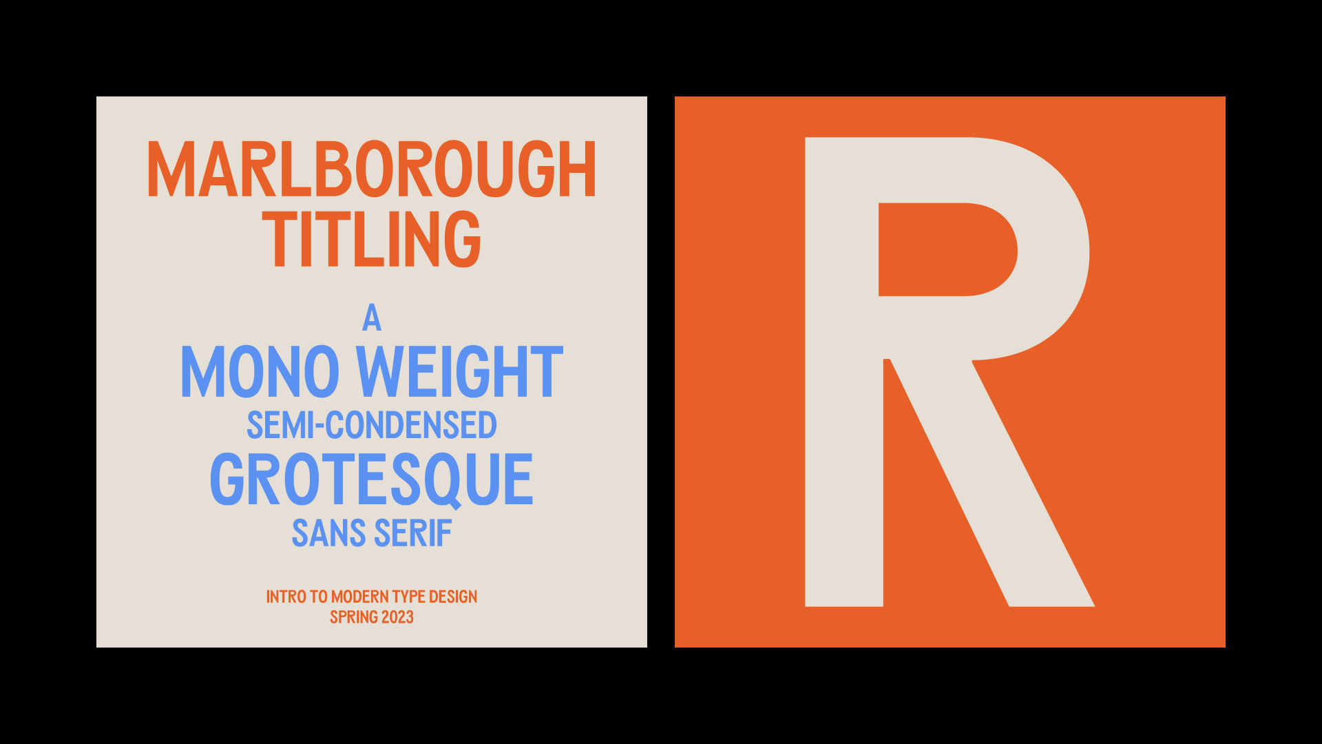
Marlborough Titling
Intro to Modern type Design
April 8, 2023 • Type Design
At the end of 2022, I signed up for a 10-week Intro to Type Design Workshop through the Letterform Archive. I was feeling bold, generally frustrated, and decided to just let myself have this nice thing that I may or may not do terribly at. Fortunately, I fucking loved it and did not do too terribly either. It actually gave me some reassurance in a strange way, even though I found it all really difficult and daunting. It reenergized me…and maybe even helped me end therapy?
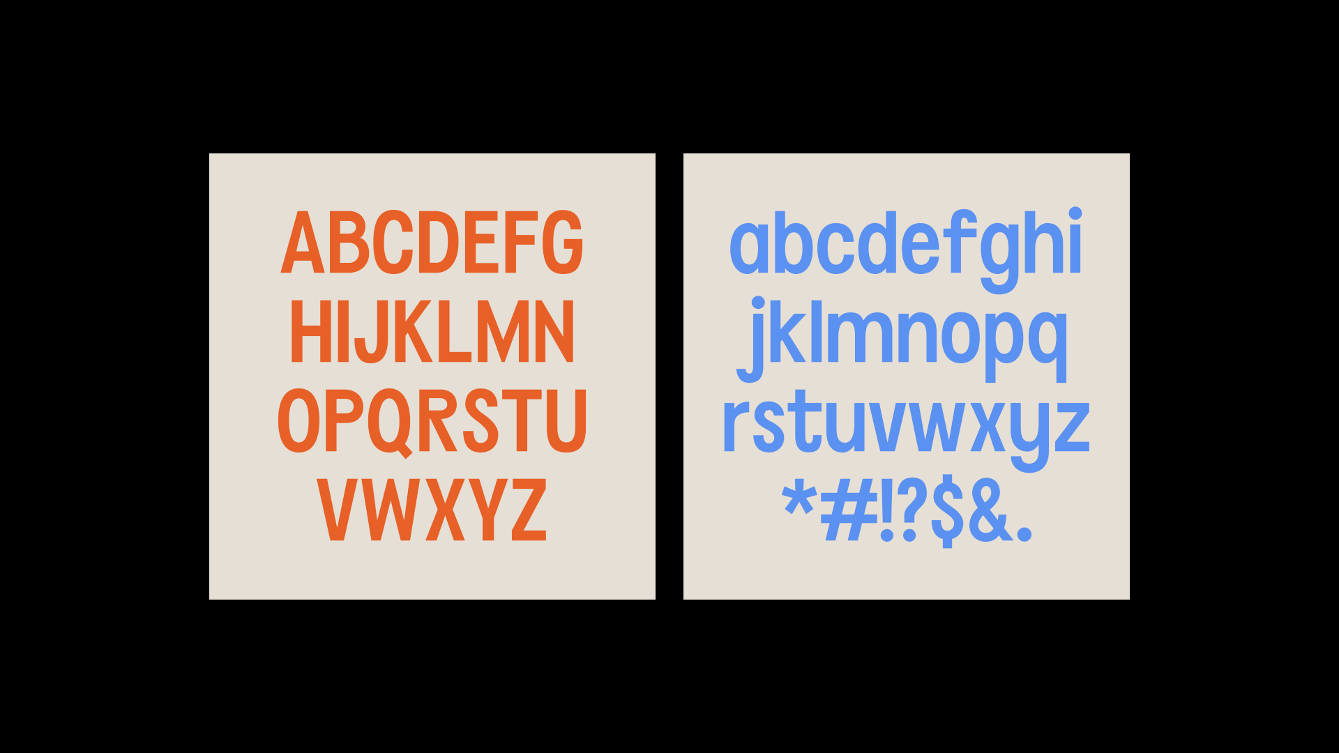
I’m not going to talk about the workshop itself here because I like to keep these posts short and sweet whenever I do come around, but I wanted to share the final outcome and where I landed on my project by the end of the workshop. Below you’ll find a few snippets of the “type specimens” for my type, which I’ve titled, Marlborough Titling. It’s not available for purchase or download, because it’s still just a concept and incomplete, but I do hope to expand the character sets and weights at some point.
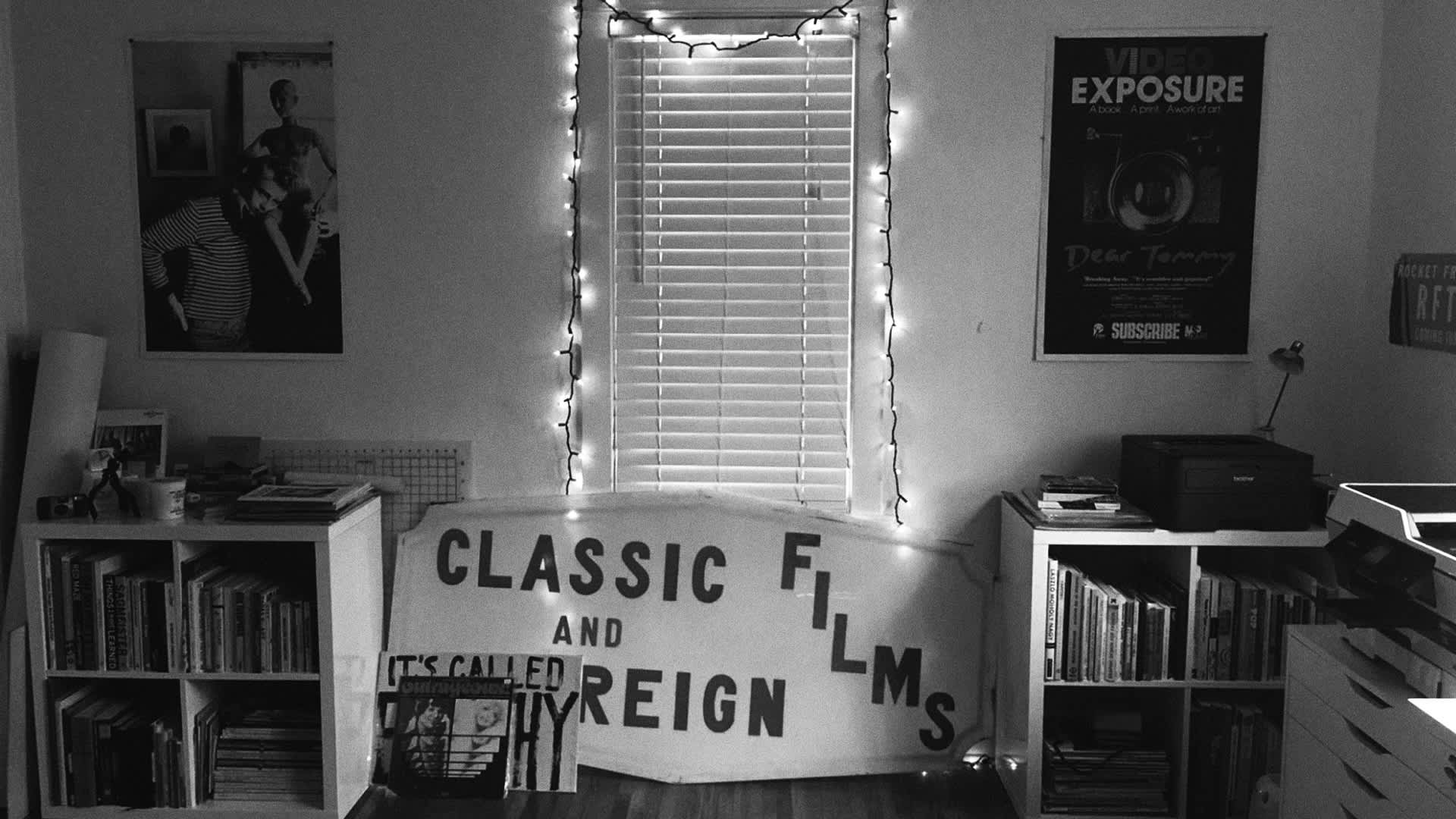
The type was inspired by an old hand painted sign outside of a neighborhood video store that closed. The last image in the set here is actually my old freelance office with the sign right in the middle…so I pretty much have to expand on it! I learned so much and am so happy I had the opportunity to take this workshop. I feel hopeful that this is a new beginning in a way. See the full project here.